Simplifying Student Banking
Goal
The UPenn Student Federal Credit Union (SFCU) is a student-run credit union serving the Penn community. It offers savings accounts, checking accounts, loans, and a credit builder program at rates competitive with larger institutions. The branch is staffed entirely by Penn students. The web design had not been meaningfully updated since launch.
Research & segments
I conducted user interviews alongside competitive research on how other established credit unions, banking services, and student-run credit unions designed their websites. I began user interviews with two of the most important stakeholders for this project, the CEO and Chairman of the organization, who gave me their insights on their vision for a website that could put a familiar face to the SFCU name. Other interviews were conducted across various member types and nonmembers to identify the following user segments:
- International Student
- Usually a grad student looking to open a loan or account with an institution offering low rates.
- Usually goal-driven but needs to be pushed toward the right information.
- Needs efficient access to rates and product details.
- Current Undergrad
- Usually an underclassman exploring banking options near Penn and new to credit.
- Doesn't come to the SFCU website with any specific reason to bank with us.
- Looking for indications of a well run institution and something they can rely on.
- Alumni
- Goal-driven. Needs easily accessible contact information and business hours.
- Calling is their primary communication method, so the website needs to efficiently guide them towards that route.
Findings
- Internationals
- Online presence is the primary channel for prospects; in-person for members.
- Confusion around whether a loan specifically for international students existed because of a page for international students under the Loan category.
- Rates information was listed but not updated.
- Application timelines and next steps were not communicated anywhere on the site.
- Undergrads
- Online presence (Instagram and website) is the primary channel for prospects.
- Students don't trust our website because there's no indication of the people running it.
- Alumni
- Calling is their primary communication method, so the website needs to support that.
- People found the persistent banner very effective, but most did not know appointment scheduling was available.
- Global
- Hard to find any information because the site hadn't been updated since it was created.
- Significant overlap across pages and tabs, no clear sense of what SFCU actually offers.
- Outdated pages throughout.
Design goals
My two goals going into design were:
- Clearly communicate our product offerings and redesign our information architecture.
- Establish trust with prospective members by communicating credibility, familiarity, and our value proposition while resolving the key pain points for international students and alumni as well.
Information architecture
The first intervention was structural. I simplified the navigation by consolidating overlapping pages, cutting outdated content, and reorganizing products into a cleaner hierarchy. The revised site tree groups account types clearly (savings, checking, loans), keeps FAQ content in one place, and eliminates pages that existed only as artifacts of prior decisions.
- Removed the International Students tab under “Borrow.”
This page had been creating confusion about whether SFCU offered a unique loan product for international students when there was no such distinction. Removing it clarified that all loan products are in one place and accessible to everyone.
- Promoted the credit builder as its own product.
Competitive research showed that most local institutions don't offer credit builder programs at all. Students frequently use them to solve the specific challenge of establishing credit, and SFCU's credit builder is a core offering, warranting its own presence in the navbar rather than being listed as a bullet in the loans section.
- Simplified the persistent banner.
Originally, this banner contained a link to our calendar, MFA notice, business hours, and ACH number. To more clearly and directly address the needs of the alumni who need to reach us virtually, I simplified it to include hours and critical updates only. Appointment scheduling was also included via a link and elevated to a primary action.
- Redesigned the About page as an orientation hub.
The About page now functions as a full narrative journey through SFCU, from who we are to our history and team. It funnels visitors toward more specific pages like the board, internships, and services, acting as a place where someone who knows nothing about us can get oriented before going deeper.
Trust and identity
The more significant challenge was giving SFCU a face. The site had no indication of who was running it, which was the single biggest trust barrier for prospective undergrad members.
- Led with impact on the homepage.
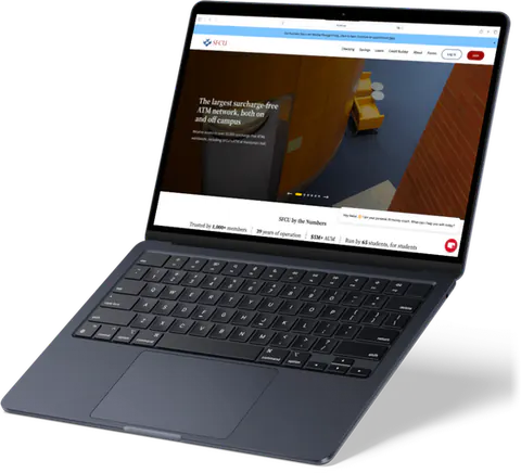
The static header was replaced with a revolving header featuring targeted messaging and images. Credibility is communicated by quantifying our impact, giving prospective members concrete reasons to trust us before they've read a single product page.
- Introduced real team photos and names.
Late in the project, we were notified that Penn's photography policy prohibited us from using any campus photos. My solution was to use high-quality photos of Philadelphia shot by our own members wherever possible (shameless plug), and to source non-generic stock images where gaps remained.
- Added institutional history.
I reached back for information on previous leadership to include on the board page, giving the organization a visible track record and sense of continuity.
- Color identity redesign.
I replaced the darker brand identity with a brighter, more contemporary look with consistent typography and scroll animations to give the site more life.
Outcomes
The redesign is live at upennsfcu.org. Feedback from leadership, team, and peers have been positive.
Reflections
- End-to-end ownership
I enjoyed making a tangible change to a real user experience and having full autonomy to lead the process end to end. In the future I'd like more opportunities to collaborate on larger teams.
- Speed of implementation
I also want to become faster at translating design into implementation… this project lowkey took months.
- Fintech and consumer finance
This project also reinforced my enjoyment of thinking about the needs of consumers in the finance and fintech space.
Future improvements
- Internal teller page.
The same semester I designed this website, the CEO wrote a teller manual containing member services procedures, teller policies, and regulations. Another initiative was an internal chatbot configured to answer common teller questions. A new internal teller page, secured by a member-specific password, can centralize this information and feature this chatbot. Furthermore, it can contain live shift information and enable tellers to request coverage.
- An updated enrollment flow.
Currently, member intake is conducted through an Adobe form. Info on next steps are communicated via email after some time and not during or immediately after the enrollment process. A step-by-step digital form with a progress bar and a more seamless document upload mechanism would reduce drop-off and keep users in the loop.