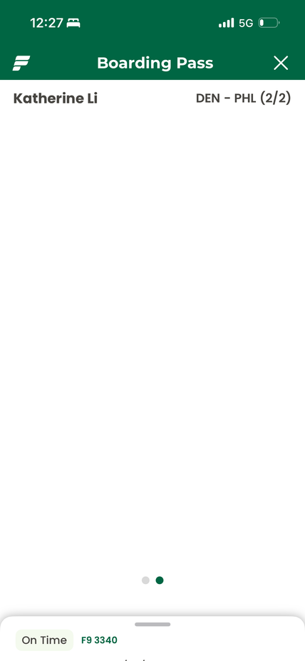

 On time
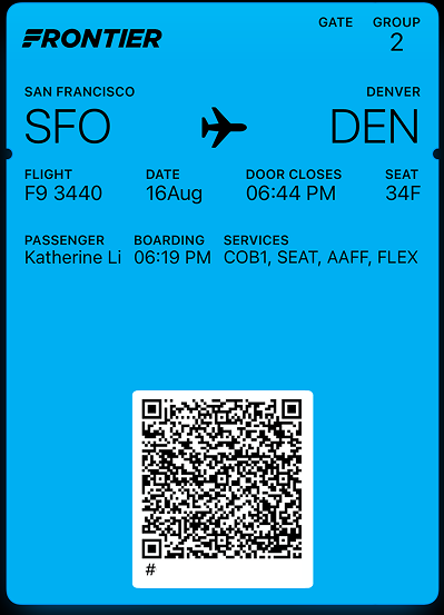
SFO7:04 PM PT
2h 30m
DEN10:44 PM MT
GateA78
Group2
Seat34F

Boardingin 14m
Doors close6:44 PM

 On time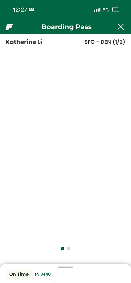
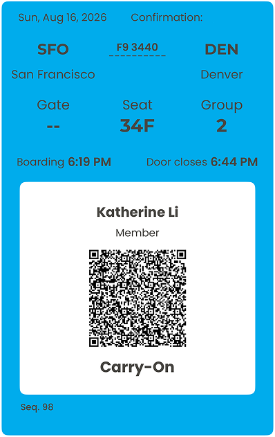
 Boarding PassOn time
Swipe either pass or tap the dots to move from before to after.
During my layover, which turned from 1 hour into 7, I found my boarding pass poorly designed and unhelpful, and decided to redesign it.
A boarding pass has to be the single reliable source of truth for a passenger in a very chaotic, transitory state. A passenger looks for different information at very different moments, so they need to locate any one piece of it instantly and to know that what they are looking at is current.
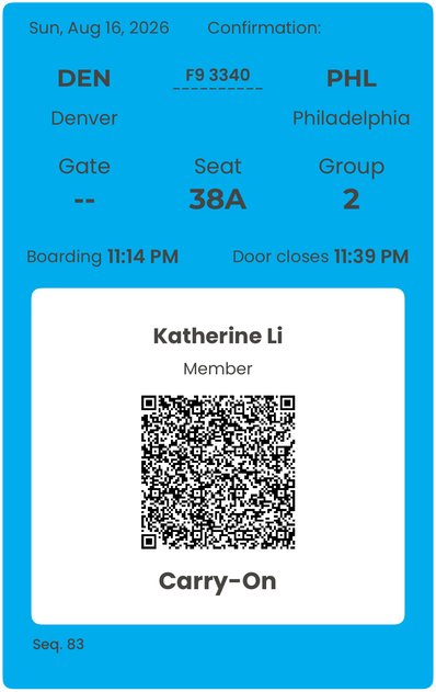
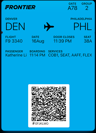
What I didstripped down to most relevant info and grouped them (metadata, flight, seating and boarding, boarding times).
What I didMaintained similar designs for in-app and apple wallet, with apple wallet stripped down for feasibility (2 primary fields and 5 auxiliary fields).
What I didAdded dynamic indicators like “On time” and a countdown that would activate past a certain threshold (e.g., 30 min left to go).