Reimagining On-Demand Tutoring for Students
Goal
Flux is an on-demand tutoring start-up with the mission to enhance student outcomes by offering on-demand tutoring for high school and college students across diverse subjects, utilizing emerging technologies to deliver exceptional value to both students and tutors.
Research & insights
For this step of the UX pipeline, I analyzed responses the team's student survey and conducted over the phone interviews with current students within the K-12 age range.
Over the phone interviews
I scheduled calls with 3 students from various educational backgrounds to understand their priorities in the tutor search process and their behavior patterns of how they use existing on-demand products such as Uber, DoorDash, and Lyft.
Survey results
Using Google's Looker Studio and Python, I analyzed 530 results to identify user preferences.
- Agency
- The app should clearly communicate the quality of each tutor and allow students to have significant control over their (tutor searching) experience.
- “Qualified tutors” was the most important named feature to a tutoring app, with 49% of users listing it as their top priority.
- 64.2% of respondents feel that it is very important or extremely important for them to be able to choose their tutor vs being matched with one.
- Users interviewed want to know from a glance that they can rely on a tutor for qualified help.
- Credibility
- The app should offer a simple but professional UI that boasts credibility.
- The app should immediately strike users as legitimate and should feel like a platform users can trust.
- Tutoring apps with minimal redirections and simple processes are more favorable because they are easier to use and trust.
- Recommendations for tutors from other users would build trust.
- Flexibility
- The app should feel accommodating to students of all backgrounds.
- The majority of respondents (33.3%) reported they would seek tutoring for standardized test prep, with studying for a test being the second most popular answer (29.1%).
- The subject of highest interest is standardized exam prep (27.5%), followed by humanities & arts (22%), foreign languages (16.9%), and college consulting (13.3%).
- It is important for users to be able to both schedule a session in advance or find a tutor right away.
- The app should offer options for all budgets, with affordability being the second biggest priority for survey respondents.
- Support
- The app should provide users with an experience beyond tutoring sessions.
- 62.9% of users reporting that it is very or extremely important for the app to have video chat, screen sharing, and whiteboard tools.
- Interviewees reported session summaries would be useful to synthesize information.
- Features such as streaks, friend activity, points/rewards are efficient motivators in learning and on-demand apps.
Insight statements
- As a student seeking SAT prep assistance, I want my experience to be as specific as I want it to be (i.e., I can narrow down to a specific sub-topic of the SAT if I want to).
- As a student who has completed a session, I want to be able to refer back to content discussed during the session.
- As a student looking for tutoring, I want to be in charge of my tutor search experience and want to be able to quickly evaluate the credibility of potential tutors.
- As a student just discovering Flux, I want to be able to instantly trust the app based on its UI.
How Might I…
As I began designing the low-fidelity wireframes for Flux, I considered:
- Reduce the amount of time spent on student/tutor matching?
- Deliver a personalized experience to students in need of tutoring?
- Best present tutor attributes/qualifications to a student?
- Display the information so that users spend as little time learning how to navigate the app, and thus, jumping to evaluation?
Ideation
I began sketching low-fi screens to start developing the general organization of the app. With (digital) pen and paper, it was easy to begin visualizing the app's main pages and the navigation bar.
Design system
I started this project with a lot of creative freedom. Besides the established logo colors, I was able to play around with the visual identity of the app. With credibility being a top goal, I wanted to 1) keep the design simple and 2) give Flux a strong and recognizable brand identity, so I started off with a limited palette consisting of a light grey, white, the Flux branding gradient, and a few accent colors (light green and purple). To keep the design friendly and readable, I stuck to two fonts, Manrope and Inter.


Design
Home and search function
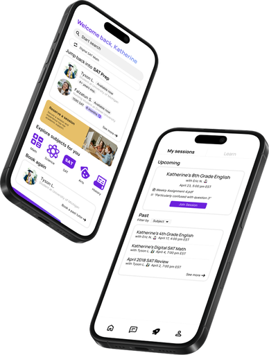
I wanted to address the key quality of flexibility to allow each user to enjoy a personalized and specific matching experience while not compromising on simplicity. To do so, I broke the search process into two key steps to ask users the two questions that addressed their needs most: where and when? To keep the design simple, I ensured sections could be easily collapsible.
The booking process
In my research, it was clear that the biggest priority users had for tutors was quality. In making this design, I wanted to give tutors the opportunity to differentiate themselves with a one-line description, similar to how it is in LinkedIn.
Additionally, each tutor's listing includes tags that reflect their qualifications in standardized terms (degree and years of education and reflect the tutor's qualifications that apply to the user's search. Providing this information ideally helps the user take full control of their matching experience.
One key challenge I faced in the design phase was making sure I accounted for all the concerns and priorities of my audience; while I accounted for the preference for quality tutoring expressed by students, I initially failed to account for another big priority for students pricing. My final high-fidelity design includes a price indication at the top right corner of each listing on the search page that immediately draws the user's attention. Additionally, to provide further flexibility to aid the matching process, I included sorting and filtering features.
Another challenge I faced was translating my mobile designs to desktop, featured above. I found that sometimes, the translations weren't—and shouldn't—be 1:1. Without making the design inconsistent, changes such as simplifying the main tabs were needed to make the desktop experience intuitive for users.
Messaging, My sessions/Learn, & Profile
Last but not least, the other main pages: Messages, Learn, and Profile. I took inspiration from commonly used messaging apps to keep the communication process for the app simple and familiar. The third tab is divided into two “My sessions” and “Learn.” Users can quickly access information regarding upcoming and past sessions.
In “Learn,” users can access a built-in AI feature to quickly build onto existing knowledge based on documents and experience within the app, providing academic support beyond a simple online meeting model. The profile tab adds onto this experience through the inclusion of a points system and personalized session analytics.
Lessons
This project was a great opportunity for me to walk through the entire UX/UI pipeline while working on a practical, challenging project. In future projects, there are steps I would take again, and some additional considerations I would keep in mind.
- Addressing user priorities
While synthesizing user research, I realized the importance of quickly translating user priorities and concerns into practical, actionable design features. If not, a priority or a concern remains just that and risks being unaddressed. I found that keeping a checklist of these considerations and features kept me accountable in addressing all the needs of my audience as best I could.
- Organized documentation
I additionally realized the importance of proactively understanding the design process in steps (or versions). Instead of continuing to iterate on one single project file, I found later that restructuring the way I think about and organize/document the design progress (numerous steps instead of one continuous sprint) helps me make more organized and consistent changes to my project.
This project was a great opportunity for me to address user needs with the business needs of a new startup, and I'm eager to continue working to bring Flux to fruition.